12 stories
·
0 followers

Why It’s So Hard to Make Usability Sexy

2 Shares

Every time I’m in an electronics store to buy something or whenever I’m assisting one of my friends identify the right new gadget for them, I notice the feature-counting we’re all swept into as soon as we start comparing our options; "Well, this coffeemaker has 15 buttons, it has to be better than that one with only 6 buttons."

As a usability professional, my decision is frequently biased towards the usability and design of a product rather than its number of features or its price.

But, I must admit, even as a person who regards usability very highly, it’s extremely difficult to keep my mind straight and focused on design and usability when I’m shopping.

Here’s why.

Usability is Very Subjective

For products like electronics and the food you get at a supermarket, a lot of efforts have been made to make comparisons among them extremely simple.

For example, in the European Union, the EU Energy Label makes it crystal clear whether or not your new fridge or washing machine will be energy-efficient.

Source: en.wikipedia.org

The labeling scheme quickly tells us which of our options will save us more money in our electricity bill and which one will have less of a negative environmental impact.

In addition, the EU Energy Label is a simple yet clever way to make us all aware and worry about energy savings in our buying decisions. Every time we’re about to buy an electronic product, the labeling scheme reminds us that energy efficiency is an important factor to keep in mind.

For food, we have standardized nutrition labels to help us decide which breakfast cereal or brand of potato chips is better for us:

Source: fda.gov

The creation of a rating system for usability would appear to be a good solution because, just like with any rating system, it will achieve these two things for buyers:

  • It will allow us to compare usability between products
  • It will make us aware (or remind us) that usability is important

However, a usability rating system clashes with one of the cardinal points of usability itself: Different users have different needs. In other words, usability isn’t as cut and dry as the number of calories in our potato chips.

Perhaps we could create a usability rating system based on objective qualities related to usability, such as page load time, average clicks it takes to perform a user-action, background/foreground color contrast to measure readability, and so forth. But that type of rating system will only be able to tell a small portion of the entire usability story of a product.

Feature Count and Price is Easier to Use

I’ve found myself comparing the features and prices of two or more products on e-commerce sites simply by opening each option in their own browser tab and then just tabbing back and forth between them.

When we are comparison shopping, we can easily count and evaluate features and prices, and then come to a quick conclusion.

The same applies to brick-and-mortar stores, where we can actually see and touch the products we are considering. In stores, feature sheets and salespeople will never miss the opportunity to remind you that if your TV isn’t able to record five TV shows at the same time, you will never achieve happiness in life. And — surprise — the "slightly more expensive" TV right over there has it all. See? It says so right here in the feature sheet.

We do this as well when choosing which web app to sign up for. We can go to each "features" page and "pricing" page and readily decide which app suits us best.

But usability is completely absent from feature sheets because you can’t easily measure it.

Usability is difficult to convey to another person; how can we objectively show that our product is more usable than another? How can a person evaluate usability without first using the product for a significant amount of time?

A product’s list of features and price are easier to use and more readily available to us, so we often default to them for our buying decisions.

Can We Make Usability Sexy?

I think usability has an opportunity to become a factor in purchasing decisions in the next few years as our design techniques and understanding of user-centered design improves.

As web professionals, we are now much more aware of the importance of usability in the success of our products.

Now we need to figure out how to make usability a significant component in the buying decisions of people.

Related Content

About the Author

Daniele Grassi is a UX Designer and CTO of Timeneye Time Tracking, a time tracking web app designed with usability in mind. Follow him on Twitter or on his personal blog.

The post Why It’s So Hard to Make Usability Sexy appeared first on Six Revisions.

Read the whole story
jordanvg
4553 days ago
reply
Toronto
Share this story
Delete

‘One Million Times Faster’

1 Share

Interesting postscript regarding The Schedule Makers, the lovely short film I linked to last week about the Stephensons, the husband-and-wife team who’d made the Major League Baseball schedule for 25 years — a blog post from Michael Trick, whose computer-driven computer-drive team replaced them:

I began working on baseball scheduling in 1994, and it took ten years of hard work (first Doug and me, then the four of us) before MLB selected our schedule for play.

Why were we successful in 2004 and not in 1994? At the core, technology changed. The computers we used in 2004 were 1000 times faster than the 1994 computers. And the underlying optimization software was at least 1000 times faster. So technology made us at least one million times faster. And that made all the difference. Since then, computers and algorithms have made us 1000 times faster still. And, in addition, we learned quite a bit about how to best do complicated sports scheduling problems.

Read the whole story
jordanvg
4580 days ago
reply
Toronto
Share this story
Delete

Worse is human

3 Shares

Before getting my driver’s license, I remember thinking manual gearboxes were an anachronism. Why on earth would someone want to row their own gears when automatic boxes could do it for you? Because it’s worse, and worse is charming.

This affection for worse repeats all over. People buy and adore expensive Swiss mechanical watches, even though a cheap Swatch will keep time better and requires no maintenance. Range-finder cameras take fiddling to adjust focus that auto-focus cameras have long since obsoleted. Vinyl records and tube amps still have lots of hardcore fans.

We come up with all sorts of justifications for this affection for worse. Manual gearboxes give you more control. Mechanical watches are about the craftsmanship. Range-finders have great image quality in a small package. Vinyl on tube sounds warmer. It’s mostly bullshit. Endearing bullshit, but bullshit nonetheless.

My pocket psychology take is that we love anachronisms because they’re imperfect. Like humans are imperfect. We form relationships with people who are flawed all the time. Flaws, imperfection, and worse are all part of the human condition. Tools that embody them resonate.

It’s hard to engineer this, though, but it’s worth cherishing when you have it. Don’t be so eager to iron out all the flaws. Maybe those flaws are exactly why people love your product.

Read the whole story
jordanvg
4651 days ago
reply
Toronto
Share this story
Delete

Why Attend Sporting Events When the View is Better from the Couch?

1 Share

Some sociologists went to the US Open final and posted about it on Facebook. Here’s what they saw. Notice the size of the court.

1

(Photo by Jenn Lena)

I saw the match too. When I got home from work, I turned on CBS. Here’s what I saw.

2 3

On my 40″ flat-screen Samsung, I could see the match as though I were in the box seats, nothing between me and the court. I could see the grimace on a player’s face, the sweat stains on his shirt. I sat on an upholstered chair. And it cost me nothing.

How much was a plastic seat in the top rows of Arthur Ashe Stadium? I don’t know. My grounds pass on Day 3 was $66. Seats for the finals were $95. I have sat up there near the top. The players are colorful miniatures moving around on the green rectangles. The distant perspective allows – forces – you to see the whole court, so you are aware of placement strategies and patterns of movement you might otherwise not have noticed. But tennis isn’t football; strategy, especially in singles, is fairly obvious and not complicated.

From way up there, the players are so far away. It’s as though you were looking at your TV through the wrong end of a telescope. You see the game differently, and you hear it differently. A player hits a solid backcourt shot, and for a noticeable half-second or so, you hear silence. Only when the ball is clearing the net do you hear the impact of the stroke.

Why go out to Flushing Meadow? It’s ridiculous to think about this in the narrow economic framework of money and tennis narrowly defined. My $0 view of the match was far better than that of my FB friends in their expensive seats high above the court. Close that micro-economics book and open Durkheim. Think about the match as ritual. It’s not just about Nadal and Djokovic whacking a fuzzy yellow ball back and forth for a couple of hours. A ritual includes everyone. If you’re there, you are part of that group. You are one with the with the people in the stadium and with the charismatic figures in center court

That’s why, if something is a ritual, being there is so important. Showing up is more than just80%. It’s everything. If you’re there, you are part of our group. You go to Thanksgiving dinner at Aunt Diane’s house not because the food is good. You might get better food and more enjoyment at home with take-out Chinese and a TV. You go because your presence defines you as a member of the group. Not going is tantamount to saying that you are just not part of this family.

The Final is not just any match. It is the ritual that anoints our king, hence the trophies and pageantry and ritualistic incantations (speeches) after the match. I would guess that most of the people there yesterday would choose even a so-so final over a close, well-played match on an outside court in Round 3. Because this match is so important, it generates moremana. And that energy is created by the crowd. Of course, the crowd’s perception is that it is the players who are creating that special feeling, and it helps if the match on the court is close and well-played. But the same match – every shot exactly the same – played in an early round in a nearly empty stadium would not create that same feeling for the handful of spectators who showed up.

What makes the ticket worth all the money then is not the quality of the play. It is the symbolic meaning of the ritual and the strong feeling you get from being part of that ritual. You were there, with Nadal and Djokovic. That ritual exists in sacred time, linked to other great finals matches. So maybe you save your ticket stub or your program as your link to that sacred past.

I saw the same match, and I had a better view. But I’m not going to save my cable TV bill.

Cross-posted at Montclair SocioBlog.

Jay Livingston is the chair of the Sociology Department at Montclair State University. You can follow him at Montclair SocioBlog or on Twitter.

(View original at http://thesocietypages.org/socimages)

Read the whole story
jordanvg
4651 days ago
reply
Toronto
Share this story
Delete

Are Flights Full? Airline Advertising vs. Real Life

1 Share

There’s a gem of an observation in Arlie Hochschild’s classic book, The Managed Heart.  She observes that, at the same time that airlines try to ensure that planes take off with every last seat occupied, advertising for air travel typically does not depict fully booked flights.  Frequent passengers covet the flight with an empty seat to their left or right, so marketers make sure that ads and commercials suggest that they might get lucky.

Here’s how American Airlines depicts the experience of flying (from a Google Image search of “cabin” on aa.com):

1 2 3 4

What a great example of not-quite-truth in advertising.

Lisa Wade is a professor of sociology at Occidental College. You can follow her on Twitter and Facebook.

(View original at http://thesocietypages.org/socimages)

Read the whole story
jordanvg
4689 days ago
reply
Toronto
Share this story
Delete

Designing the Perfect Hyperlink — It’s Not as Simple as You Think

2 Shares

Designing the Perfect Hyperlink — It's Not as Simple as You Think

Hyperlinks are the glue that holds the Web together. Without links, the Web would be a very different place, that’s if it would exist at all. Using a simple HTML element — the <a> element –you can create a bond with any other web page on the Internet. Hyperlinks are magical.

Hyperlinks are fundamental to the Web. They are always just there. Maybe that’s why many site owners and web designers don’t pay them the attention they deserve.

The design of the HTML <a> element is crucial in the user’s reading experience; we should take enough time to design them well.

I’m about to share with you some hyperlink design tips that will lead to a better user experience, enhanced web accessibility, and maybe even bring improvements to your search engine rankings.

Hyperlinks Need to Look Like Hyperlinks

All your hyperlinks need to stand out and clearly say to your readers, "Hey I’m a link. You can click on me."

Hyperlinks should appear interactable.

As web designers, we like to innovate and experiment with different navigation techniques, but sticking with certain design conventions is important.

One of the things that need to remain conventional is our hyperlinks.

According to a study in link readability, the regular Web user sees blue-and-underlined text as links.

Blue and underlined is a good standard to stick to, for no other reason than it’s what we Internet users have been acclimatized ourselves to.

Examples of Hyperlink Designs

Below you will see 3 different hyperlink designs. They are from top newspaper websites.

On the surface, these are all good hyperlink designs. They are some shade of blue. They stand out amongst the surrounding body of text.

But why is The New York Times hyperlink design better than the other two examples?

Allow me to explain.

A Simple Way to Test Your Hyperlink Design

Let me show you an easy method of testing if your hyperlinks clearly stand out from its surroundings.

If you blur and remove the color from the design, you will see what stands out if someone was quickly skimming or reading the page or if someone has particular problems with their vision such as low-vision or color blindness. (Read more about color testing tools.)

You can do this by:

Modifying your CSS property values for <a> and <p> elements to blur them and remove their colors

Taking a screenshot and editing it in Photoshop

  1. Image > Adjustments > Desaturate
  2. And then Filter > Blur > Gaussian Blur

Let’s look back to our earlier examples, but this time we are going to view them when they are blurred and in black and white.

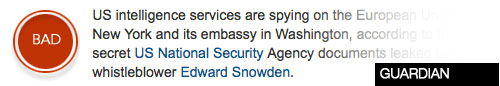
Here is The Guardian’s; you can see that the hyperlink is hard to spot:

BBC uses a bold font weight to create emphasis on their hyperlinks, which is marginally better than The Guardian’s hyperlink design because it at least stands out a bit more.

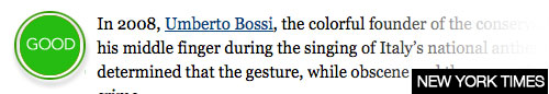
With The NY Times, it’s still possible to work out where the link is.

The Problem with Underlining Links

Now here’s where it gets tricky.

Here is where hyperlink design gets a bit unsimple.

Here is where our convention of underlining links fail.

There is a study that shows that readability decreases when we underline the text in our hyperlinks.

The study says that underlined links have "seriously underestimated effects on the usability of Web pages."

The study reports that our current convention of underlining hyperlinks "can significantly reduce the readability of the text."

The researchers go as far as saying, "alternatives should be carefully considered for the design of future Web browsers."

Essentially, the researchers are saying that our current conventions for hyperlinks — underlined text — should be changed systemically.

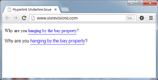
The reason why underlined hyperlinks reduces legibility is that certain characters that go below the base line — characters with descenders extending below the underline such as p, g,  j, and q — are getting affected by the text-decoration: underline CSS property value.

Here is the default style of hyperlinks in the Google Chrome web browser (version 28):

What’s the Solution to This Readability Issue?

We can fix this readability issue ourselves. We don’t have to wait for a change in the way web browsers render underlined text by default.

How? We can use the CSS border-bottom property instead of the CSS text-decoration property to underline our hyperlink elements.

Using the border-bottom property can place the underline a few pixels below the affected characters, making the hyperlink easier to read.

Here is the CSS used for the image above:

a {
	text-decoration: none;
	padding-bottom: 3px;
	border-bottom: 1px solid blue;
}

Even more powerful than just fixing a readability issue, we can also control the underline’s style independently from the hyperlink text color, thereby decoupling these two components of a hyperlink.

For example, we can reduce the hyperlink underline’s distinctiveness to make the text more legible, or we can make it more distinctive to make the entire hyperlink design really stand out.

For the purpose of illustration, I changed the underline color just a little bit, making it a lighter shade of blue:

CSS:

a {
	text-decoration: none;
	padding-bottom: 1px;
	border-bottom: 1px solid #8d8df3;
}

Make Hyperlink Text Longer

This next concept I’m going to discuss goes a bit into content strategy territory (which is a big part of web design process).

Some of you might dislike this suggestion because it deals with the content creation process, and some of you might not have control over that part of the web development process.

The basis for this next tip I’m going to share is Fitts’s Law.

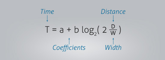
The concept of Fitts’s Law is simple. The law states that the larger something is, the easier it is to see and interact with.

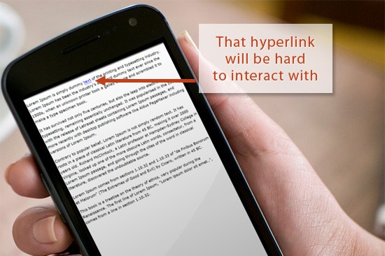
That makes sense, especially in the context of touchscreen devices where the size of your elements matter, where the input device (our fingers) is less precise than a mouse pointer.

Using a finger to click on a hyperlink can be a pain; often times you will have to zoom in for small links, adding an additional barrier towards users getting the action they desire (which is to interact with the hyperlink).

But there is only so much we can do with the style of our links.

We can bold them, underline them, change their color.

How about making them bigger by changing their font size?

If we change the <a> element’s font-size property, it affects the reading flow, and can affect the consistency of our line-heights.

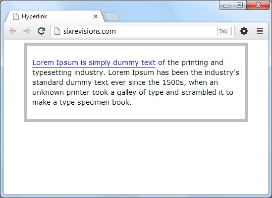
Look at how the continuity of the reading experience is disrupted by increasing the font size of hyperlinks:

So we can’t expand them vertically. We will need to expand them horizontally.

User-friendly SEO Benefits

Having longer anchor text is a user-friendly SEO tactic. That is, hyperlinks with longer link titles is better for users according to Fitts’s Law, but it also has the nice side benefit of being better for search engine rankings.

Anchor text should be descriptive and should tell the user and search engines what the page you are linking to is about, according to Google’s Search Engine Starter Guide.

Say you were writing about walls.

Compare the two ways a hyperlink is used in these sentences below:

"I would like to talk about advanced wall-building techniques. Click here to learn how to build a basic wall because what I will talk about is beyond the basics."

Versus:

"I would like to talk about advanced wall-building techniques. You will need to learn how to build a basic wall because what I will talk about is beyond the basics."

Not only is the second version better for our user, but it is additionally better for search engines too because there is more context than the anchor text that just says "here".

Should Hyperlinks be Blue?

According to a study by Google blue links got more clicks than greenish-blue links.

The study I referenced earlier about underlined text readability likewise affirms that Web users immediately recognize links when they are blue and underlined.

However, in my opinion, not all hyperlinks absolutely need to be blue.

The important thing about hyperlink design is that your links are obviously links.

If you can achieve that with a different color other than the conventional blue color, go for it.

Microsoft Development Network (MSDN) supports this concept.

The fundamental guideline about designing hyperlinks "is users must be able to recognize links by visual inspection alone—they shouldn’t have to hover over an object or click it to determine if it is a link," according to their link design pattern guideline. They didn’t say anything about links needing to be blue.

There are some cases where blue-colored links aren’t the best option.

For example, if the background color makes it hard to read blue links, then usability and readability triumphs over the standard blue link convention.

Always do what is best for the user, even if that means breaking conventions.

Summary

Here are the big ideas:

  1. Designing hyperlinks should be well-thought-out.
  2. Blurring and removing color from the design is a quick way of demonstrating how well your links stand out.
  3. Underlined text is a strong and familiar convention. The problem with underlining text, though, is that readability decreases. The solution is to use CSS to remedy the issue.
  4. Using longer descriptive anchor text can improve usability (Fitts’s Law), with the added benefit of being better for search engines.
  5. The one thing that is important in the design of hyperlinks is this: hyperlinks should obviously look like hyperlinks.

Related Content

About the Author

John Macpherson is a freelance web designer and marketer based in the beautiful Aberdeen, Scotland. Web Payload is a design resource he’ll be launching soon, follow them on Twitter @webpayload. His personal ramblings can be found at @johneemac.

The post Designing the Perfect Hyperlink — It’s Not as Simple as You Think appeared first on Six Revisions.

Read the whole story
jordanvg
4714 days ago
reply
Toronto
Share this story
Delete
Next Page of Stories